

Great eXPECTATIONS
Title design concepts for FX.
The direction was to create a title treatment that had a rough textured quill-pen script style to it, while also staying true to the style of the era.
Below are my hand-drawn versions, scanned and vectorized and put to various options of the (in progress at the time) key art.
Ultimately, a different direction was chosen, but I really enjoyed and liked how some of these came out.
*The lettering on the finalized key art is not my own.
Fountain Pen & Lettering Marker Sketches


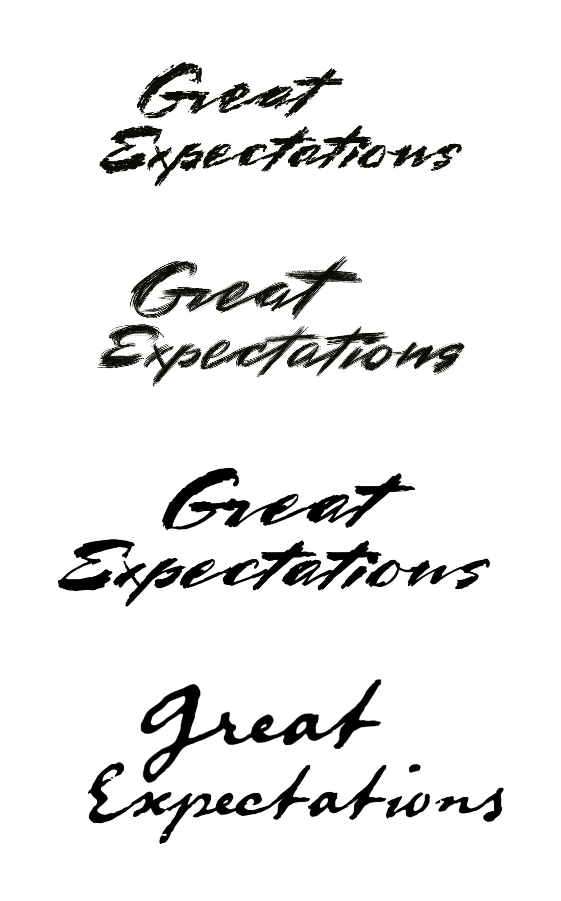
Scanned and Vectorized Logos


